Introduction
Background: Tracking what we eat is often more difficult than it should be. There are several tracking options for people, but actually understanding how we eat is more than simply tracking calories. A lack of nutritional education may also be one of the causes of psychological issues that have been linked to calorie tracking.
My goal for this project was to find a way for people to better understand their nutrition while being able to avoid the hang-ups that come with tracking calories.
The problem: Calorie tracking is a tedious task because every ingredient and dish is unique and needs to be accounted for. This leads to a lack of motivation and quitting.
The solution: A simplified process for finding and logging calories was created, as well as goal tracking and resources for learning in order to motivate users to continue tracking their nutrition.
My role: Sole end-to-end UX/UI Designer
Research
The first step on my journey was to find out who exactly my users were, and what problems they were facing. I had a hypothesis about this problem space, but I need to be sure what the primary users were dealing with. So, I began with high-level research to see what problems competitors were already solving.
Secondary Research
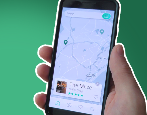
Competitive analysis: In order to better understand the problem space, I downloaded and familiarized myself with three of the top calorie-tracking apps. This gave me a better idea of what a larger range of users were experiencing.
Heuristic Analysis: I then conducted a heuristic analysis to find ways to improve on these competitors' solutions. This is where I began to understand something very important about the calorie tracking space. Each app I tested performed very well when analyzed through these heuristics. This discovery pointed out to me that the problems users are facing don’t necessarily come from the tools they are using, but rather from the mindset behind them.
Primary Research
Make a plan: With my competitive research still in mind, I began the process of conducting my primary research by creating a detailed road map. This would serve as my guide through the rest of the research process.
Find Users: If I was going to talk to users, I needed to find them first. This was done with a simple screener survey that helped me find people who were at least somewhat familiar with calorie tracking and had invested some time into their personal fitness.
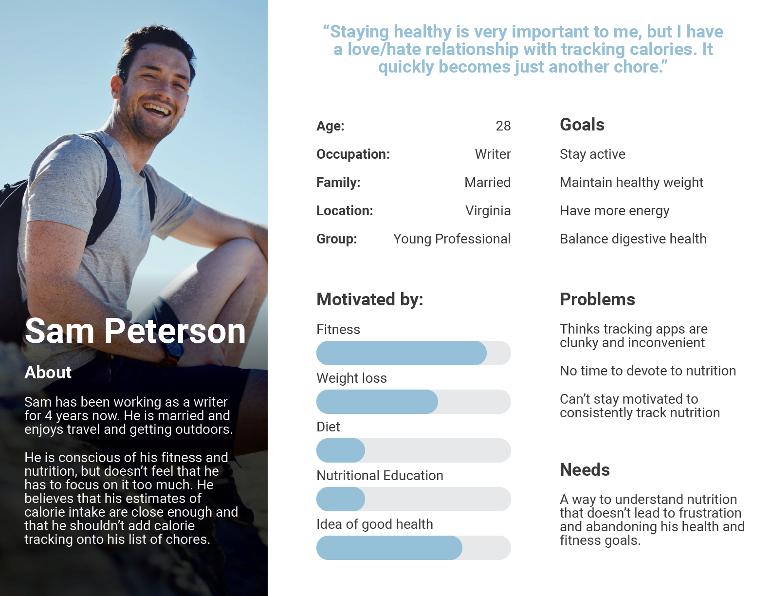
Interview Users: This is where my hypothesis really started to come to light. I interviewed five users and almost all of them expressed the same pain points I had on my own fitness journey. Better still, several users said the exact same phrases about the problems they were experiencing. I knew I was on the right track to understanding what my users were dealing with.
“I guess I have a love/hate relationship with calorie tracking.”
- Nathan
- Nathan
Gather Data: With my users interviewed, I began to gather the information I had received and turn it into usable data. This was done through:
Affinity Map > Empathy Map > User Personas
User Persona: For this project, I opted to focus on only one persona, since most of the data I received from my users was very similar. This persona was then used throughout the remainder of the project, and would even help with knowing who to recruit for user testing later on in the project.
Iteration
Mind map: One of the things I’ve learned from my years as a graphic designer, is that it’s best to get anything down on paper for your creativity to attach to. Starting at a blank page doesn't get you very far. This is why I began my creative process with a simple mind map to address the user's needs and begin solidifying my ideas.
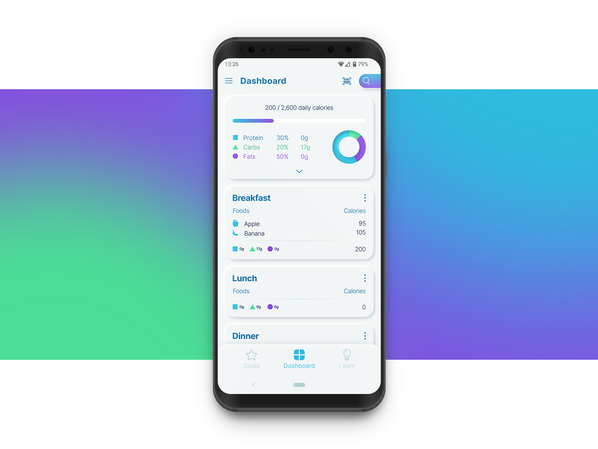
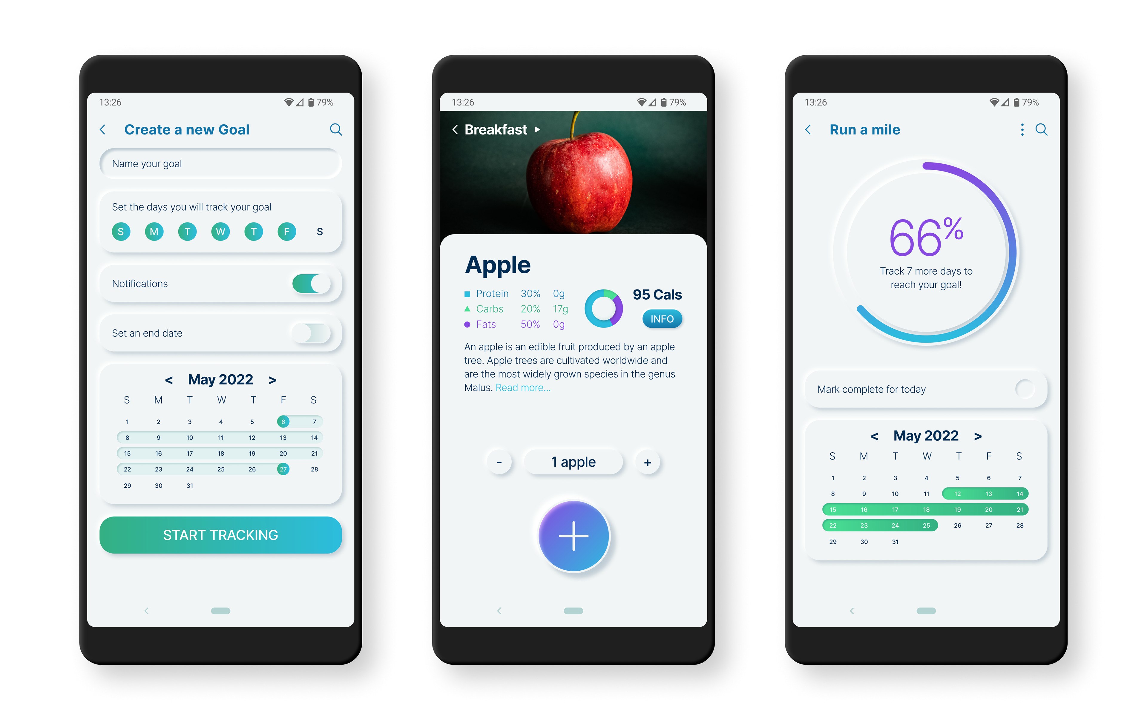
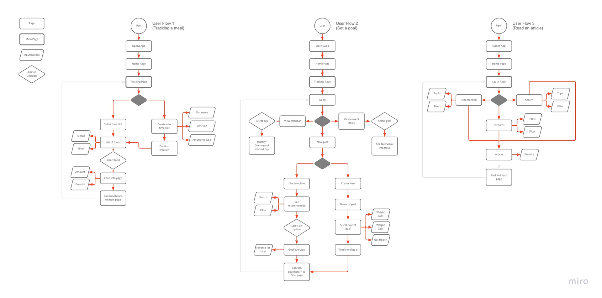
User flows: Understanding how users would navigate the app was critical. Early in the process, three main routes were identified. Tracking (later called the dashboard), goals, and learning. Each route would require its own unique path, but as you will see later, these paths would need to meet at the end.
Sketches: Every good designer knows that the best place to start is with pen and paper. This is a process I am very familiar with, and I was very excited to get started putting the ideas I had rolling around in my head on paper. I set some parameters for myself to ensure I didn’t get lost on any one screen and began sketching out the multiple screens that would be needed for my app.
Guerilla Testing: In order to know if I was on the right track, I took my sketches and turned them into a rough prototype. I then set up in my local coffee shop and began to ask strangers for feedback. This was a very informative part of the process since it showed me areas to improve and areas where I had the right idea.
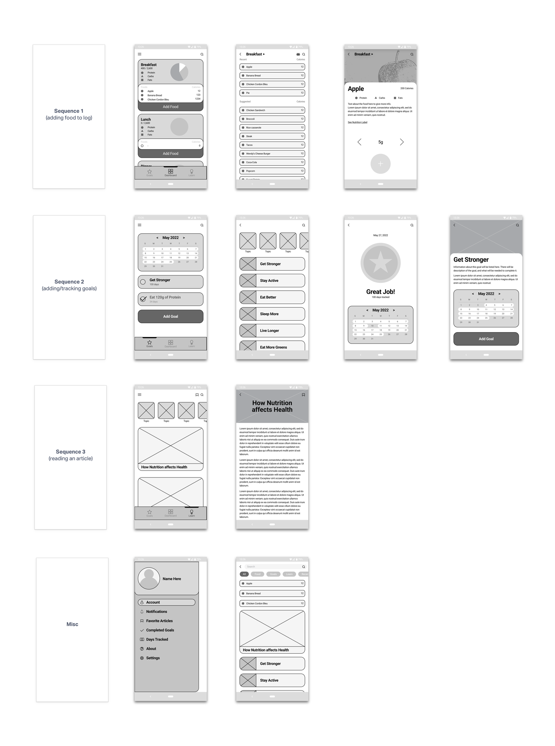
Wireframes: Using the information I gained from guerilla testing, I reiterated several of my screens and created mid-fi versions of each screen. This is where the app really started to come to life, and I could see areas where my layout would need to be adjusted and refined for the final version.
Testing
Usability Testing: Once I created my hifi mockups of the app, I was ready to show users what I had created. Their feedback was critical at this step in the process to point out any pain points and ensure that the app was functioning as intended.
Round 1: During my first round of testing, some very key issues came to light about my app's user flow.
• The users' paths for goals and learning had to be linked since users typically preferred one route over the other when prompted to track a goal.
• The main dashboard needed fewer buttons for adding food to your log. The multiple paths were bogging down the tracking process and making it difficult for users to know which route to take.
• I learned a lot about user behavior in terms of what route they prefer to find information. In the final version of the app, more specific pages would need to be incorporated into the menus for users that preferred to navigate through alternate routes.
Round 2: With my now refined app based on the first round, I conducted a second round of usability testing. My main goal with this round of testing was to see if I had resolved the issues I had found in the first round of testing. I was delighted to find that the majority of the problems users had encountered in the first round of testing were now resolved, and many users resorted to suggesting features outside of the scope of this project when they had no real issues to bring up.
Final Prototype
With my final prototype, I was able to solve several user issues, such as saving time while tracking, and easier navigation of the app.
What I Learned
After all of this, I learned a great deal about user behavior and the design process. One of the main takeaways was that I needed to dive even further into what made this problem space a problem in the first place. I discovered that no matter how simplified and streamlined I made calorie tracking, this was still an answer to a deeper problem.
Calories tracking is already the answer to the question of health and fitness. And Health and fitness is the answer to the problem of wanting a happier and more enriching life. I was able to reduce the number of steps needed for tracking and give users options for staying motivated on their journey, but in the future, I will be able to see even deeper problems users are experiencing.
Closing Remarks
In the end, I was able to deliver a product that I am proud of, but I also can’t help but see the greater potential for how this problem of calorie tracking can be solved using design principles.