Introduction
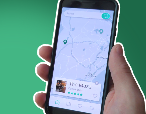
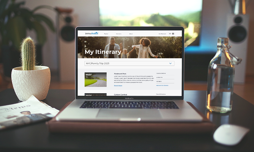
Background: This project was done alongside three other Springboard students for the client Do You Weekend (DYW). We were limited to 40 hours over 4 weeks to work on this project. DYW is a startup travel website that focuses on helping users craft their perfect weekend getaway. When we began our work with them, we were given less information than we needed and little to no measurable information from users.
The problem: When we started work on this project, the client had a prototype of their site, but until this point it was untested. Multiple errors and holes on their site needed to be fixed, and we needed to find out if their site was even viable.
The solution: Our two main solutions were to run usability tests in order to uncover issues, and our second was to locate and fix clear usability problems.
Client requests: Conduct usability testing on the current prototype and create the missing login/signup screens.
My role: I was one of four UX/UI designers with my main role being the primary contact for my team and the client. I was responsible for communication, scheduling, presenting, and visual design work.
The Mystery
Defining the problem
During our introduction meeting, the client gave us direction on the project based on what had been recommended by previous teams. This gave us a good idea of what was expected of us, but we still needed to better understand what sort of problems we were trying to solve.
While reviewing hand-off documentation, we began to notice several pieces of missing information. Wireframes were inconsistent with what we saw in the prototype, and obvious usability errors were everywhere.
Moving forward
In order to work around the discrepancies we found and begin to pinpoint the errors, we decided an audit of the existing prototype was needed before recommending a plan to the client. This audit listed all of the dead ends and usability issues and would help us to better communicate to the client what we would need to do. After meeting with the client at the end of the week, we received approval to make necessary changes, as well as an endorsement to move forward with testing even with an imperfect prototype.
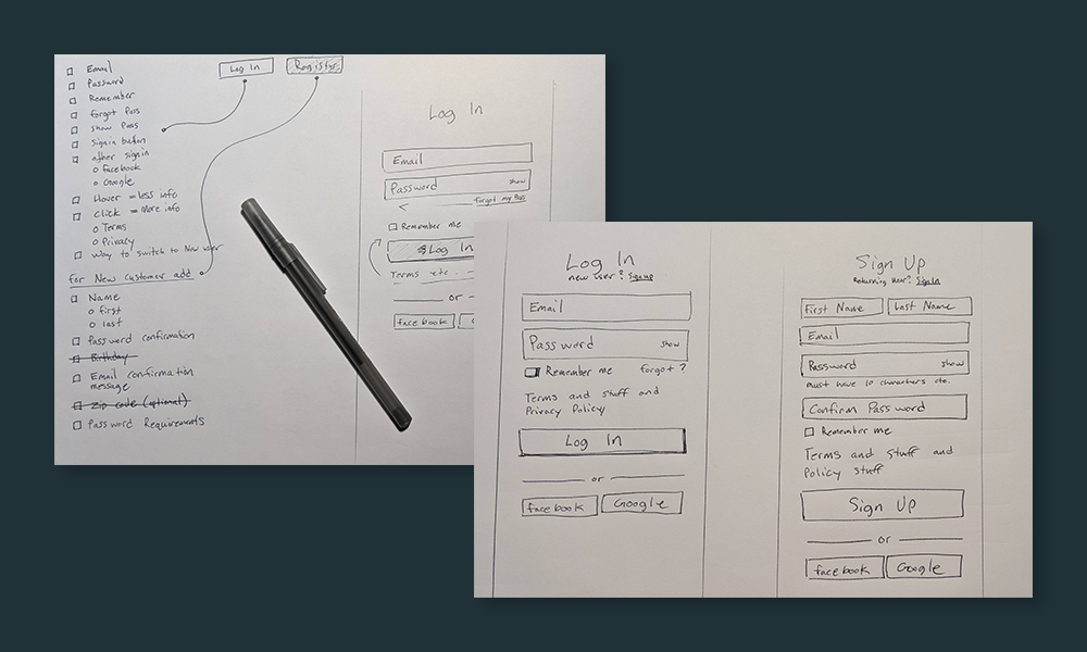
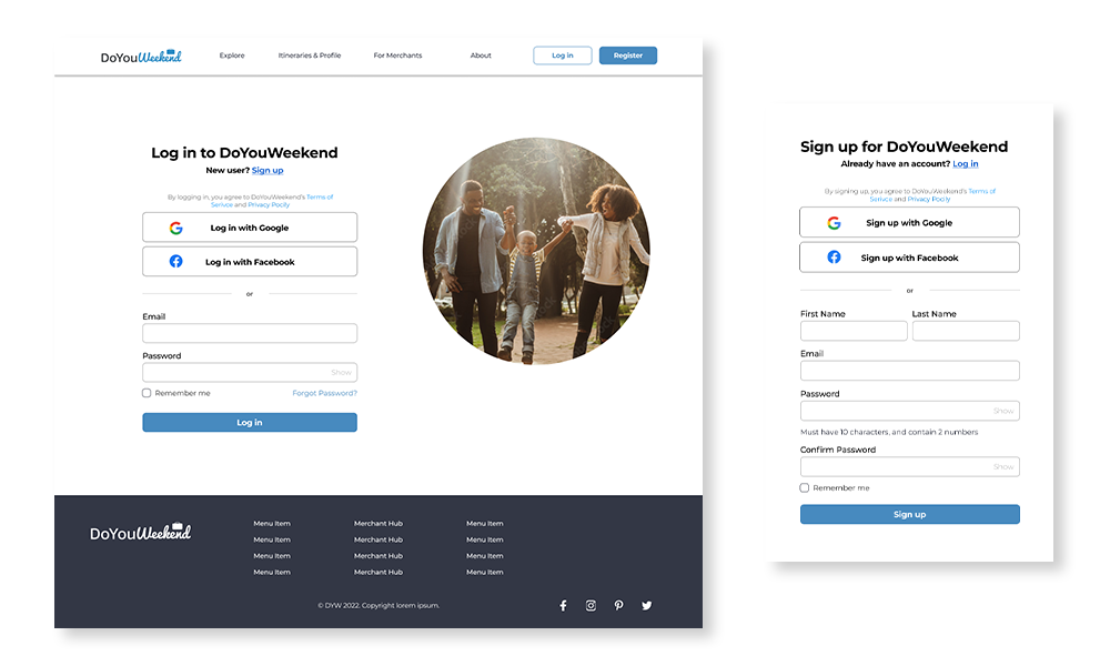
Login wireframes
While testing was beginning, I and another teammate began work on the client's second request, a wireframe for the missing login and signup screens. We conducted secondary research, and then met to compare notes. After gathering up our research, we included it in our next meeting with the client.
One of my main tasks for this project was to create presentations for our meetings with the client. We wanted to be sure we had visuals to help communicate what we were working on. During this first progress report, I had to give the difficult news that we did not believe they would be ready to move into development by the time we were done working on their project. Thankfully, I was able to call upon my previous experience and present this news in a way that answered their questions and helped clarify the issue.
Prep for testing
Beginning week two we started by creating our testing plans and scripts. While we were doing this we began to source participants for our test. This testing would stretch into week three but we gained a lot of insightful knowledge from our testing.
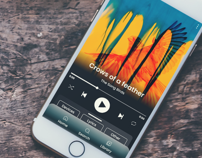
Login high-fi screens
While half of the team was working on conducting usability tests and sourcing participants, myself and another teammate worked on creating the high-fidelity login screens for the sign-up process. Using both of our backgrounds in graphic design we were able to create two screens for the login and sign-up process and were able to turn this over to the client much earlier than expected.
Learning along the way
What we found from the process of creating these login screens is that the steps needed for login screens are already buttoned down very well. We mainly had to draw inspiration from what others had done and make sure that it fits within the design parameters of our client.
At the end of this week, I created our second presentation for our client meeting. While we had much fewer visuals to present this week, we still wanted to ensure that we could show our progress and make sure that the client was on board with what we were doing. Since this week was mainly about testing and finalizing our login screens, we showed our designs for the login screens and gave an update on how testing was going.
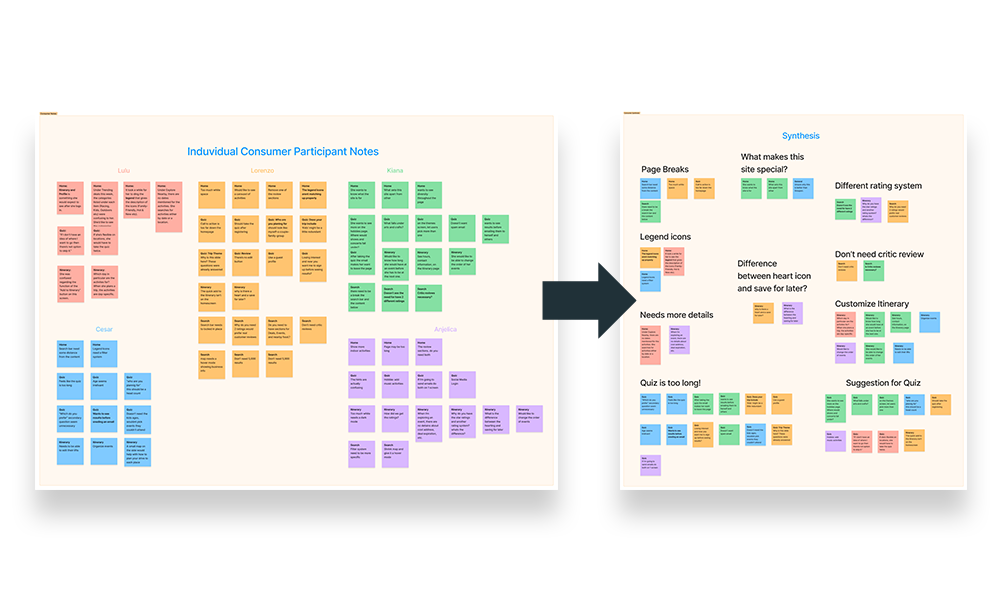
Synthesis
At the beginning of week three, we finished all of our user testing and begin the process of gathering our data. We chose to meet as a team to create an affinity map. This ended up being a long night as there was a lot of data to sort through, but it was a rewarding experience as it helped us work together to group all of the data into usable information. When we finished this affinity diagram we created a spreadsheet that listed out all of the usability problems we had found from testing as well as our recommendations for how to fix them. We then rank each of these issues based on how long it would take us to fix and how much of a problem it would be for users moving forward.
Presenting our findings
With this spreadsheet ready we contacted our client and moved up our weekly meeting so that we could go over the issues we had found. One of the main takeaways we found from our usability testing was that several of the issues that testers were having was based on the lack of clarity of business decisions and objectives. We worked through this spreadsheet alongside our client getting approval on what we could change and what we could not. When we had finished this meeting we were ready to make our changes based on what was approved.
Implementing & Setting up for the next team
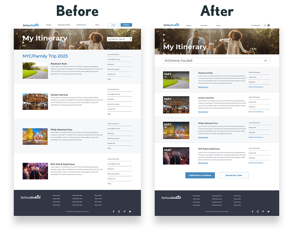
Making changes
Our objective for week four was simple. We needed to finalize all of the changes to the website prototype, and we needed to create a clear guide for whoever came after us. One of the issues we faced in the first week of this project was not having a clear idea of what we needed to do. We wanted to do our best to avoid this for future teams. We made all of the necessary changes and again moved up our meeting so that we could ensure we would be finished by our deadline. We showed the client before and after images of their prototype and explained the thought process and designs behind each.
Organizing
With all of the necessary changes complete we made sure to gather up all of our documentation as well as our detailed handoff document for the next team. We then turned this over to the client and communicated how much we had enjoyed working with them.
What I learned
During my time working with this team, my primary role was that of communications leadership. This may not have been what I was used to but I found that it was incredibly helpful to test my skills of communicating with non-designers as well as communicating with my team of designers. Working with C-suite stakeholders was an exciting learning opportunity, and is a skill that I look forward to honing further in the future.
I also learned quite a bit about usability testing. One of my main takeaways from testing was to ensure that the prototype you are using is well polished and easy to use. When I ran into hangups during the usability test I conducted, it was clear to me that an easier-to-use prototype would have yielded better data.
Testimonial
“Caleb, Lonzo, Mengqi and Sara (alphabetical order) were Team 6 in a long UI/UX-based design project for doyouweekend. Caleb took the lead for all communications.
This was an amazing team, and each member worked both as a team and individually and no communication was missed despite working remotely across different time zones.
This part of the project was difficult: Not only did Team 6 have to go back and review--and correct--the design and UI/UX work of the prior teams, but they were charged with the additional heavy lift of feasibility testing for both the consumer side and the business side.
Their work was exemplary and they helped clarify and fine tune numerous open- ended issues we need to resolve.” - Rich