Outcomes:
• Improved form submissions across the whole site.
• Directed site traffic down more appropriate paths.
• Removed confusion for login.
• Directed site traffic down more appropriate paths.
• Removed confusion for login.
Background:
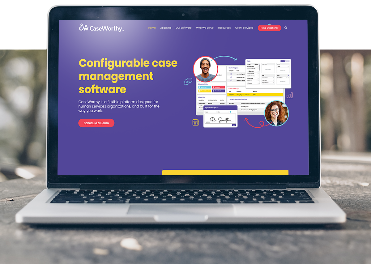
This project was conducted for CaseWorthy to improve the website 434 Marketing built-in 2020. Several usability issues had been noticed over the two years of the site being live and I was tasked with running 434’s first-ever round of UX testing.
The problem:
During the years leading up to this project, CaseWorthy had begun to notice that users were hitting a wall in the sales process. We were also seeing high bounce rates on pages that needed more engagement. Since CW relies on customers speaking directly to a sales rep, it was a huge problem that people were not reaching out to learn more about the software.
Other hypotheses had been made about the site's structure and user flow, however, it ended up being a huge win that we didn’t make these changes before testing (as you’ll see later).
The solution:
In order to improve site performance and remove user pain points we:
• Removed the unneeded login dropdown tab
• Re-designed the contact form that was causing drop-offs
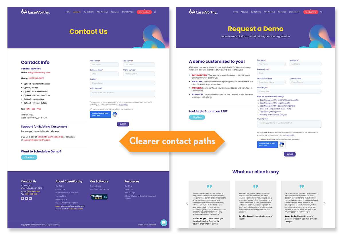
• Separated contact paths
• Increased product visibility on the site
• Made general quality-of-life design improvements.
• Re-designed the contact form that was causing drop-offs
• Separated contact paths
• Increased product visibility on the site
• Made general quality-of-life design improvements.
My role:
Sole UX designer working closely with the account manager and web developer. I also was able to meet directly with stakeholders for this project.
Process
Create testing plan
Since this was 434’s first-ever UX testing project, I had to come up with a plan that we would execute throughout the task. I had already created an SOP based on what I had been learning throughout the year but this needed to be tailored to our clients' specific needs. CaseWorthy had two main requests:
1. Find out why people were not using the contact form
2. Find out if the top navigation menu was confusing to users.
I knew we needed to actually speak to users about what was going on, so the first thing I incorporated in our testing plan was to schedule testing with several users from CaseWorthys' client list. This would prove to be one of our early snags in the project but when we finally did get to test users it was highly rewarding.
Finding the right people
In order to recruit users for testing, we first created a screener survey and then scheduled meetings based on the responses we received. We hit a small snag with our initial recruitment pop-up on the site, but once we sent out the survey link directly, we had more than enough testers.
With our users selected and meetings scheduled, I created a list of tasks as well as areas for open-ended questions for my users. I wanted to ensure that these questions would not be leading and that I would be able to get to the root of what was causing the problems. Most of these tasks centered around users finding what they needed. I also asked for open-ended feedback that would help get us in the right direction for changes to the site.
User interviews
I lead these interviews along with my coworker Brianna who helps support with notetaking and asking further questions to specify what users needed. After conducting six interviews I had a ton of data to sift through. Users had given me more than enough information and several pieces of feedback that were very unexpected.
Data synthesis
With all of the notes from my interviews in hand, I began to synthesize my notes into usable data. I did this with an affinity map in fig jam. After I collected notes from each interview I organized these notes into clusters of data. This is where the data really began to reveal itself. Having these clusters allowed me to see what users found most important and which issues were the most pressing.
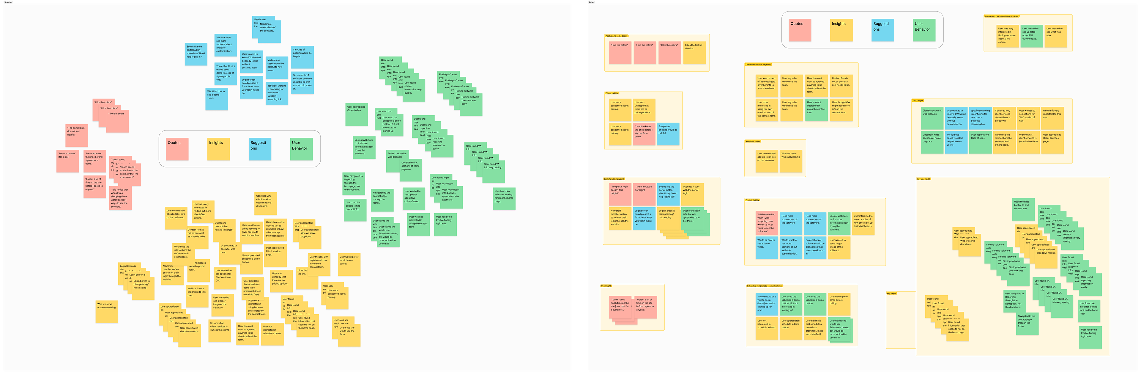
Note the massive data point on the bottom right!
Ideate with team to find solutions
Excited by all of the data I had just collected, I created a spreadsheet to lay out exactly what I would suggest we change on the CaseWorth website. This spreadsheet would not only be shared with our client but I would have to present this information to them in a way that helped them understand what we were trying to accomplish. The main columns of the spreadsheet included the problem, the priority level, and our suggested fix for these issues.
Several of these issues were extremely easy fixes, but most surprisingly the issues that would have been changed before testing were non-issues for our testers. Our team was incredibly relieved that we did not move forward with any changes before testing to discover the real problem.
Create presentation for client
At this point in the project, it was time to reveal what we had found from testing and how we hoped to fix these issues. Going into this presentation I first created a Google sheet that helped lay out exactly what we had done and give an introduction to what exactly we had been doing over the past month of testing. It was very important that they knew our process and that our data was coming from users we had tested not simply from our internal team. With this introductory information out of the way, we dove into each item of our testing spreadsheet.
Notable changes
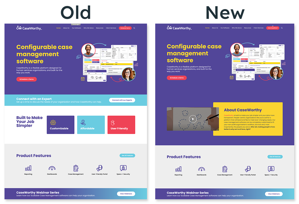
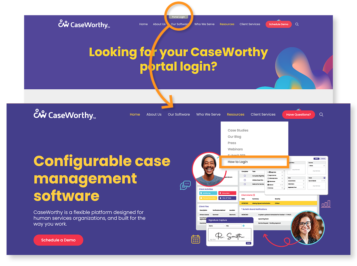
Login tab
While we were not able to change the actual login information page due to the limitations of the business, we were able to make the user journey for login much more clear. By removing the login tab at the top of the site and changing the wording of the dropdown navigation option, we were able to manage users' expectations of what they would see on the login page. These changes helped to remove confusion and the assumption that users would be able to login through the CW site.
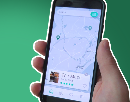
Product visibility
You may have already noticed that the home page added a new section with a video explaining what CW is. This change was made to address the issue users had of not being able to clearly see or understand what CW offered. Though this was a minor change, it has gone a long way to help product visibility and inform new users of CW’s mission.
Dropdown navigation
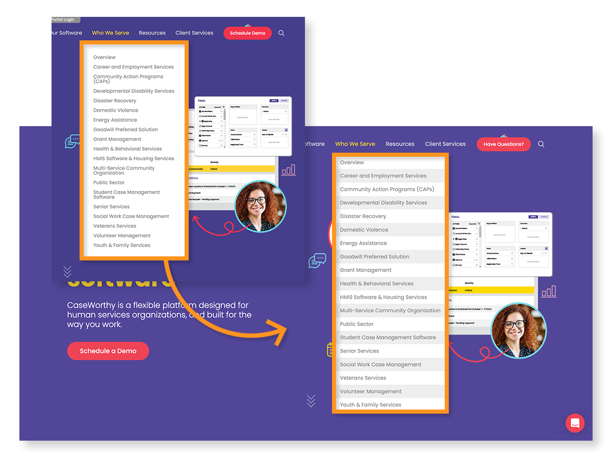
This is one of the most exciting things found during testing. One of the main reasons for conducting testing was to see if the top nav dropdown menus were too confusing or overwhelming for users. Both the CW team and the 434 team agreed that these menus would need to be changed, but decided to wait until after testing to be sure. Much to everyone's surprise, none of the users had any problems with the drop-down menus and even commented on how useful they were.
Correct paths
The primary goal of this project was to uncover pain points that were interfering with the sales process. What we found during testing, was that the contact form, which should be the primary means of communication, was a major roadblock. When the site was built the main thought was to send new users to the ‘Schedule a demo” page. The same form was used for the contact form as well. This paired with the massive block of disclaimer text attached to the form, with multiple mandatory places for information, was causing users to abandon their quest for more information.
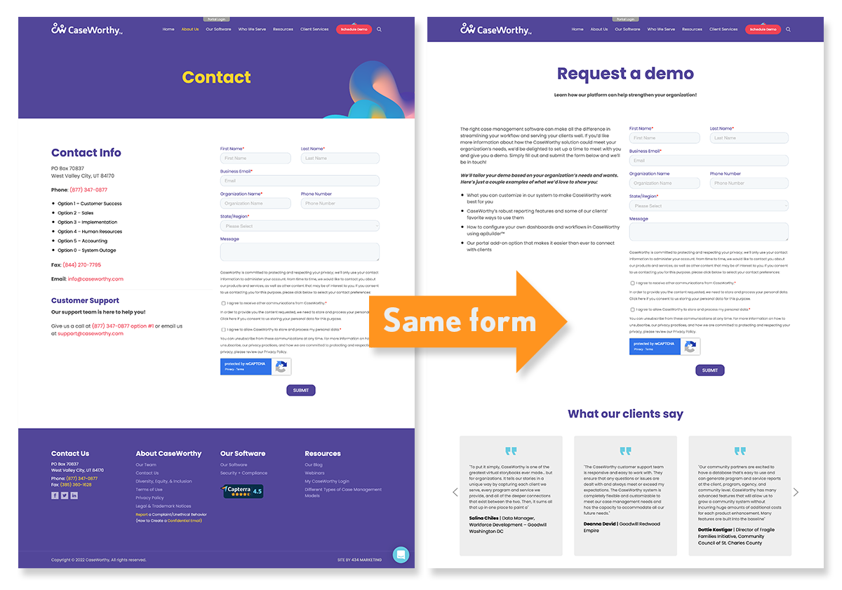
Before changes were made users were forced to
schedule a demo.
To fix this issue, we first divided out the form into two clear paths. A more simplified form that would serve as a general contact form, and a form tailored for those looking to schedule a demo. We also removed the bulk of this disclaimer text, and made much less compulsory information.
After changes were made users were directed to a more friendly contact form.
But did it work?
Though our final round of testing is not yet complete (more coming soon) we do already have data to prove that our changes have been effective. Since CaseWorthy uses HubSpot to capture information we are able to clearly see users being directed down the correct paths as intended. The next piece of data that we hope to receive is sales information as to whether or not more revenue is being generated based on the changes we’ve made.

While overall views and submissions to the schedule a demo form are down, conversion rates are up. I believe this clearly indicates that users are being directed down a more suitable path to fulfil their needs.

Overall, views and submissions are significantly improved across ALL forms.
What I learned
With this being 434s first end-to-end UX project, I had a lot to learn along the way. The process at 434 has already been refined by learning how to capture users for testing, and what sort of timelines to expect on future projects.